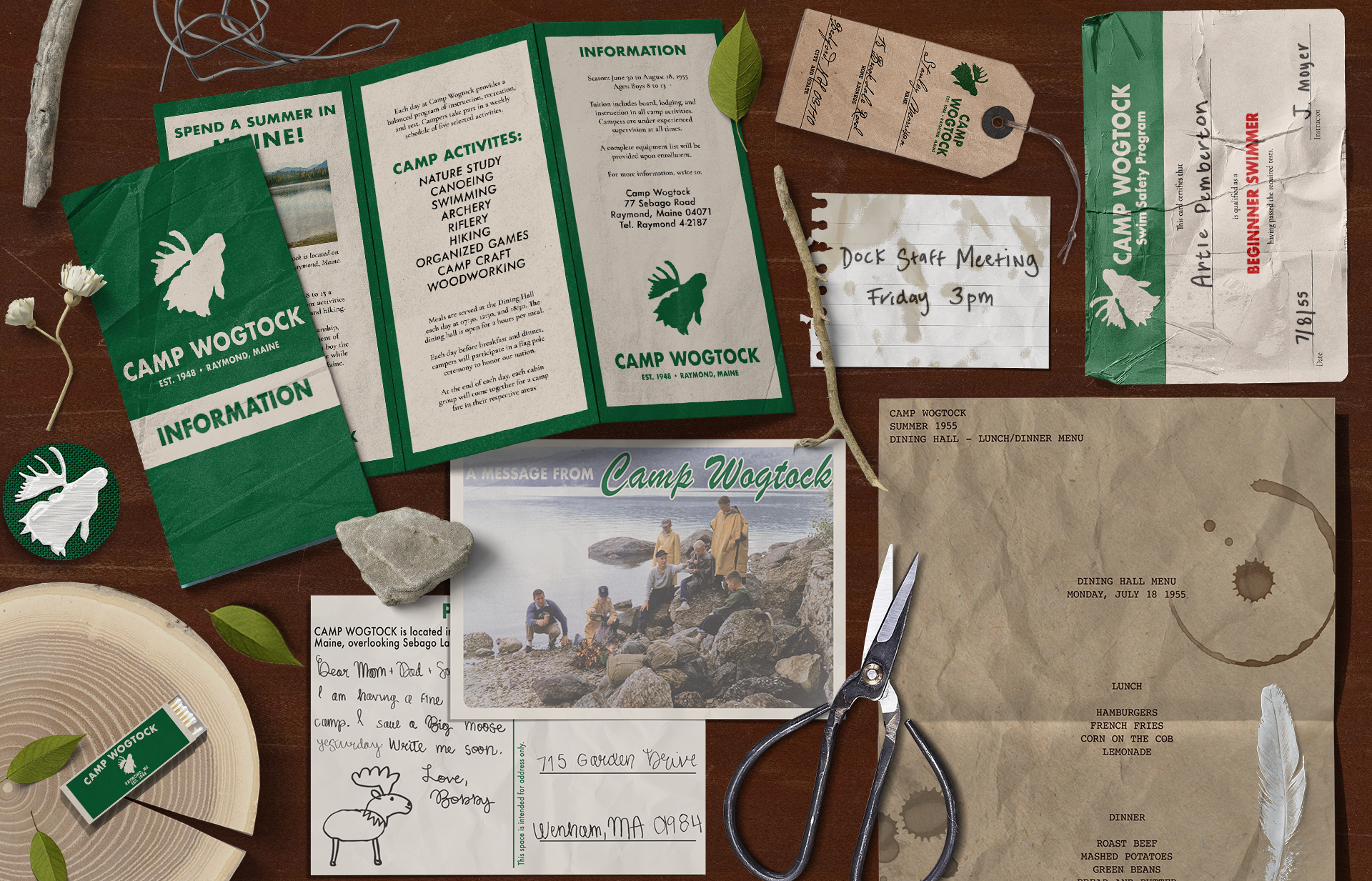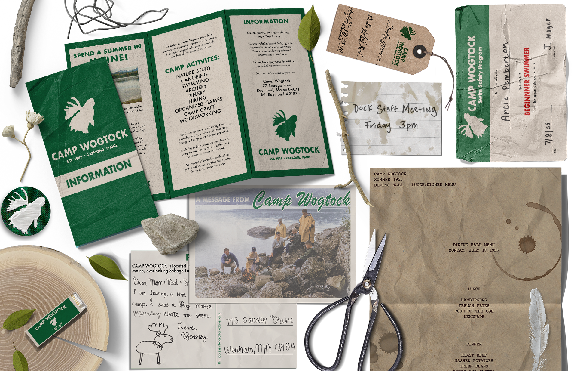
Camp Wogtock
Inspired by set designer Annie Atkins work on films like The Isle of Dogs and Grand Budapest Hotel, I set out to create evidence of a fictional world. One of those most notable parts of Annie’s work is its ability to transport you to a specific timeframe through props. I wanted to challenge myself to create historically accurate materials. For my project, I chose to create a 1955 summer camp for boys located in Raymond, Maine.
ELEMENTS DESIGNED:
Information Brochure Swimming Certificate
Camper Post Card Daily Dining Hall Menu
Matchbox Old Note
Luggage Tag Logo Patch
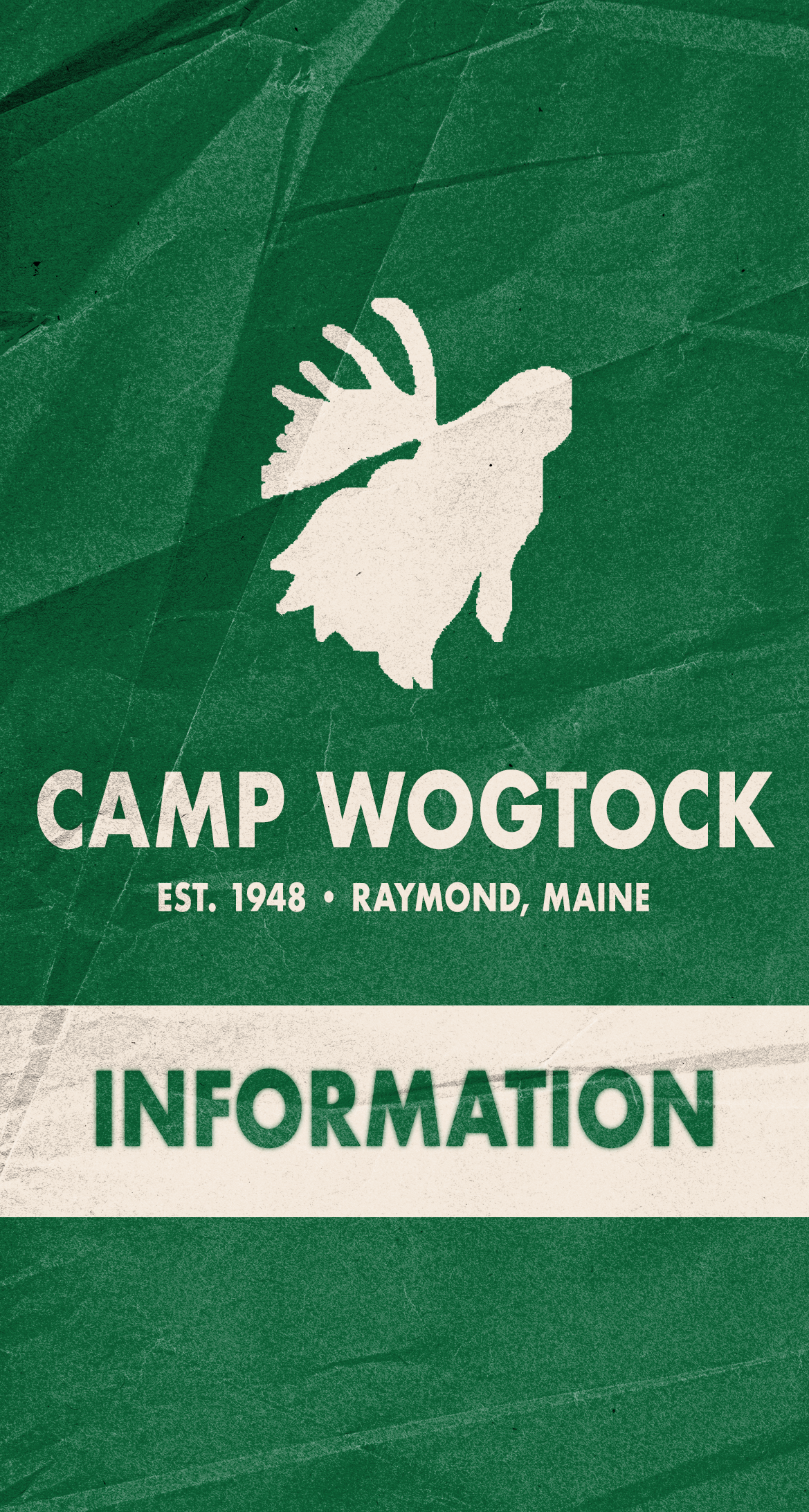
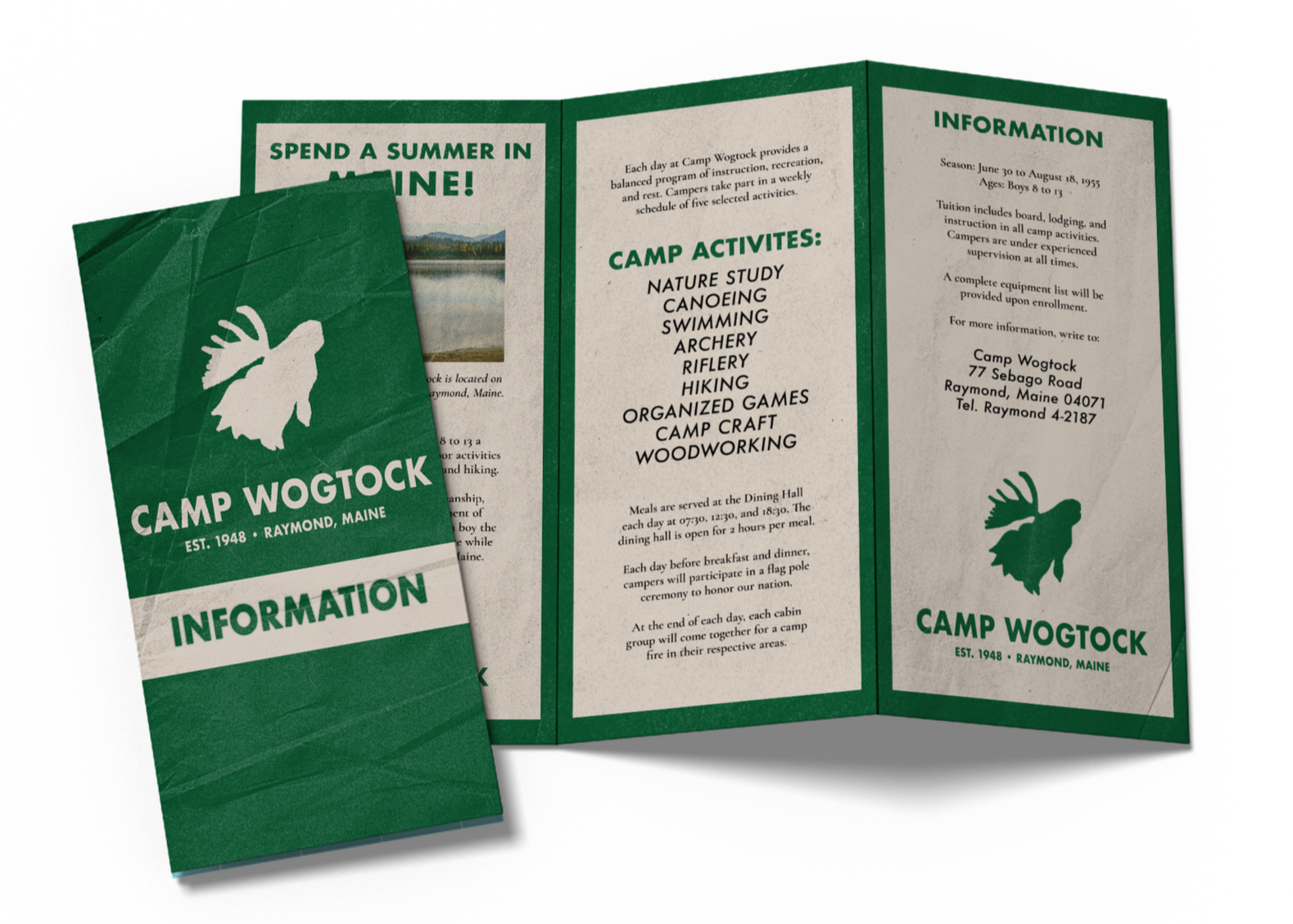
INFORMATION brochure
A brochure filled with more in-depth information about the camp, from the activities it offers to the history of the owners.
I started by designing this element first because it covers the basics of the camp, which guided me when creating the other designs.
PROCESS & SKETCHES
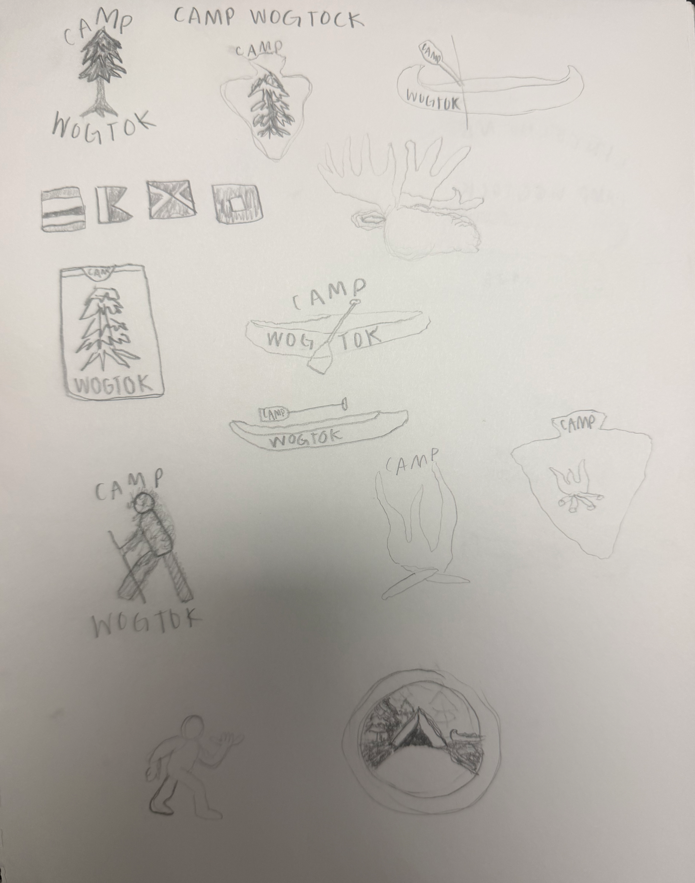
I started this process by first looking through many vintage summer camp brochures. Once I got an idea of what information I wanted to include, I focused more on brochure designs. From there, I was able to find authentic fonts from the 1950s to use throughout my project, which is important when striving towards historical accuracy.
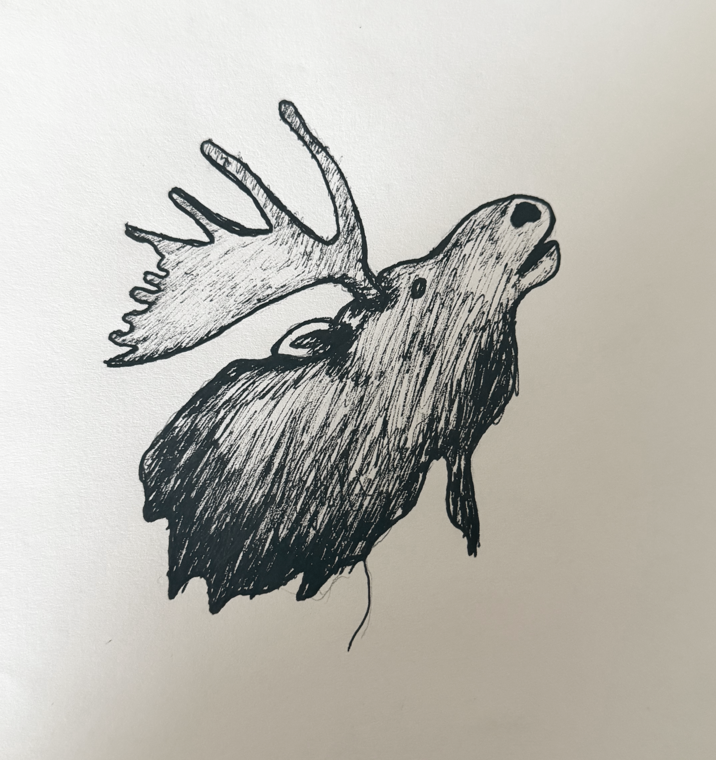
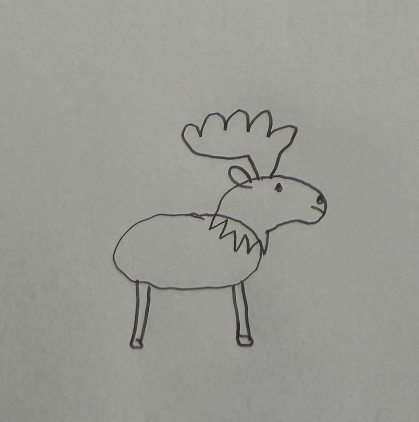
For the logo, I started by doing quick sketches inspired by the concept of vintage summer camps. I really liked the idea of making Bigfoot the focus of the logo, but upon further research I found that the legend did not exist in 1955. Instead, I researched Maine wildlife and decided to use the silhouette of a moose, which I then sketched and transferred into Adobe Illustrator.
Once I had the logo designed, I could start using it in other designs, as seen below!
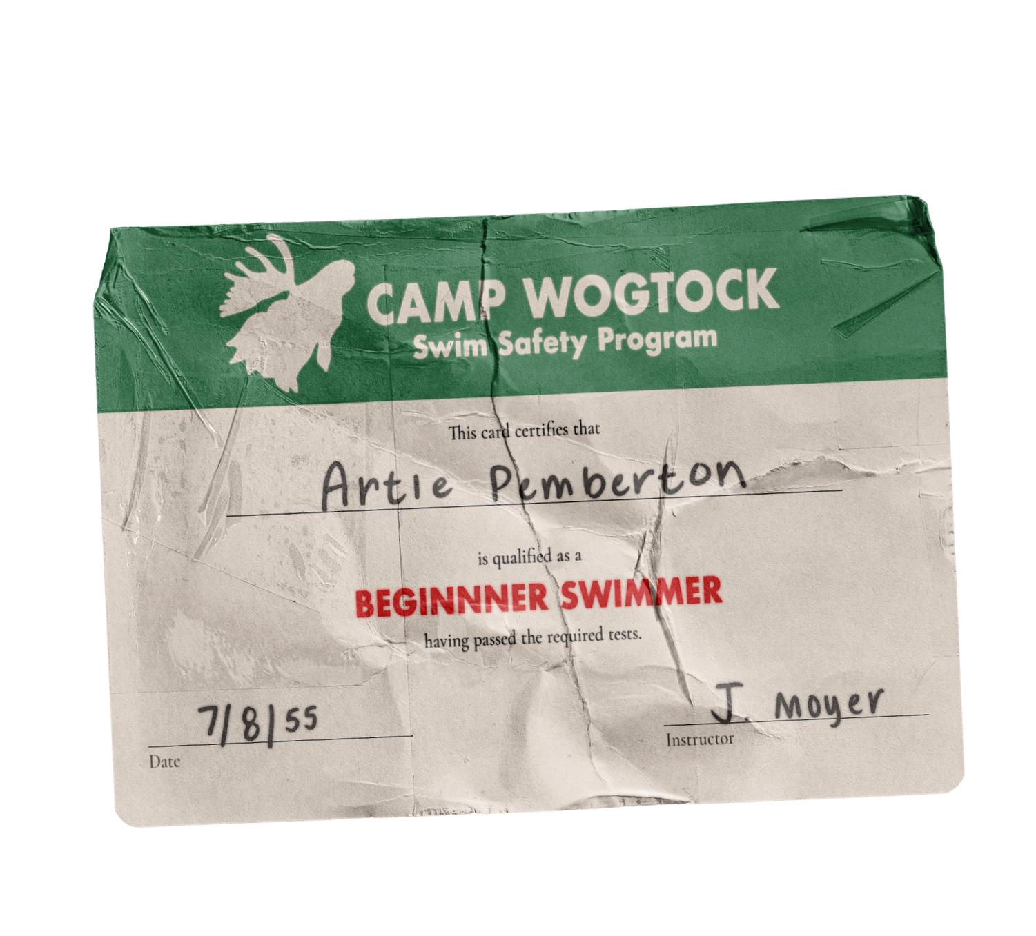

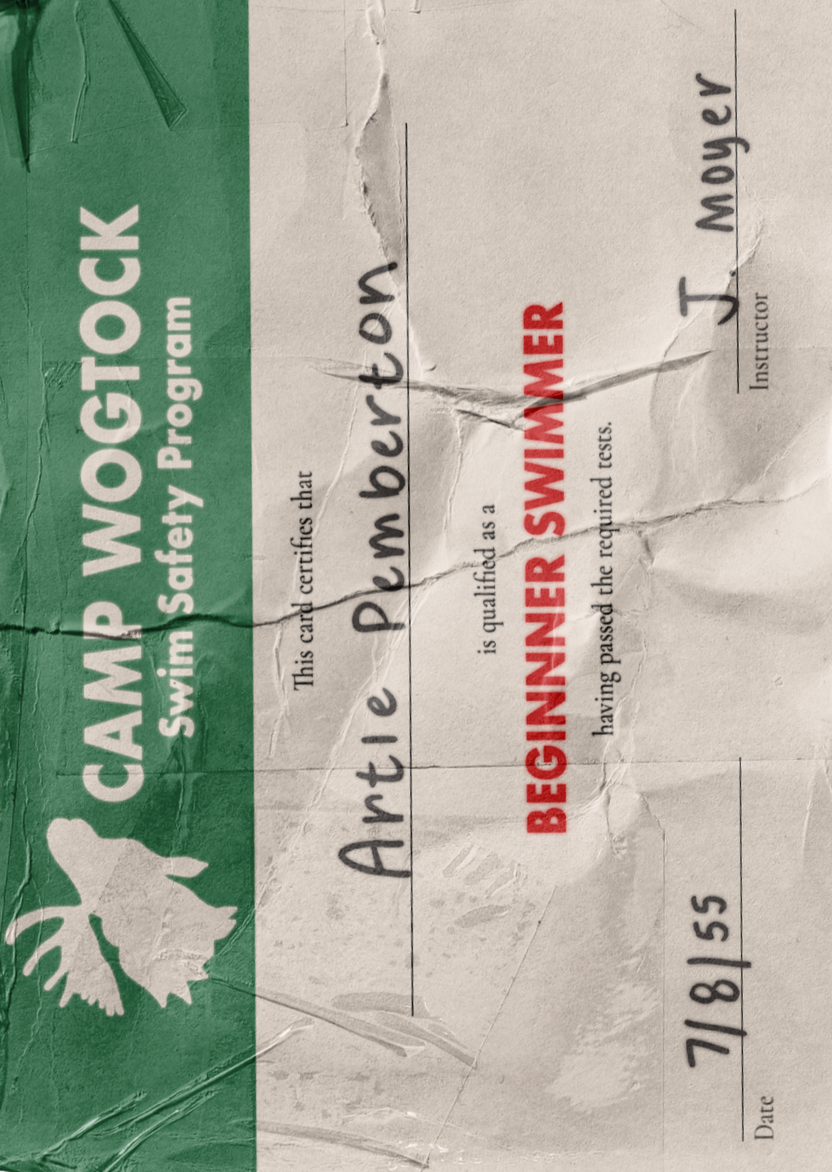
CAMPER SWIM CARD
A tiny certificate marking what level of swim tests a camper has completed. It’s crumbled, held together by tape, and the ink is weathered from being filled out post-swim test.
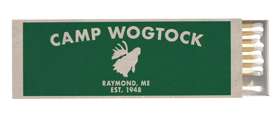
A Camp Wogtock branded matchbox, sold in the camp store and used in fire-making lessons.
MATCHBOX
LOGO PATCH
A loose Camp Wogtock patch, displaying the moose silhouette logo in the camp’s signature green and white colors.
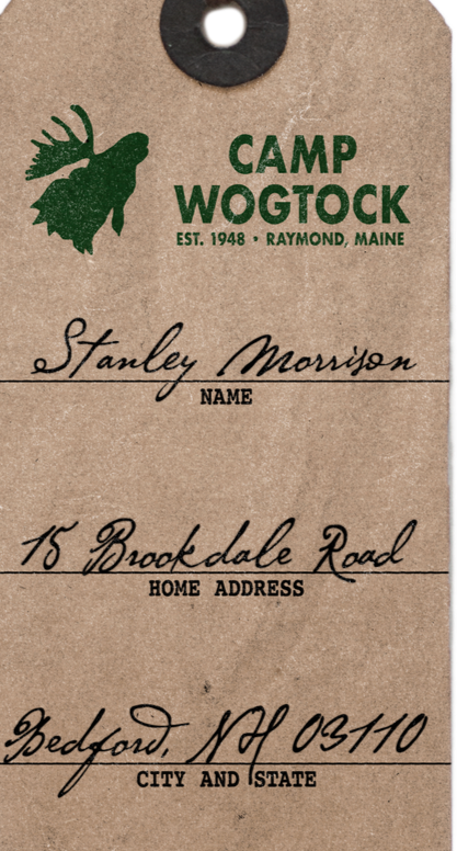
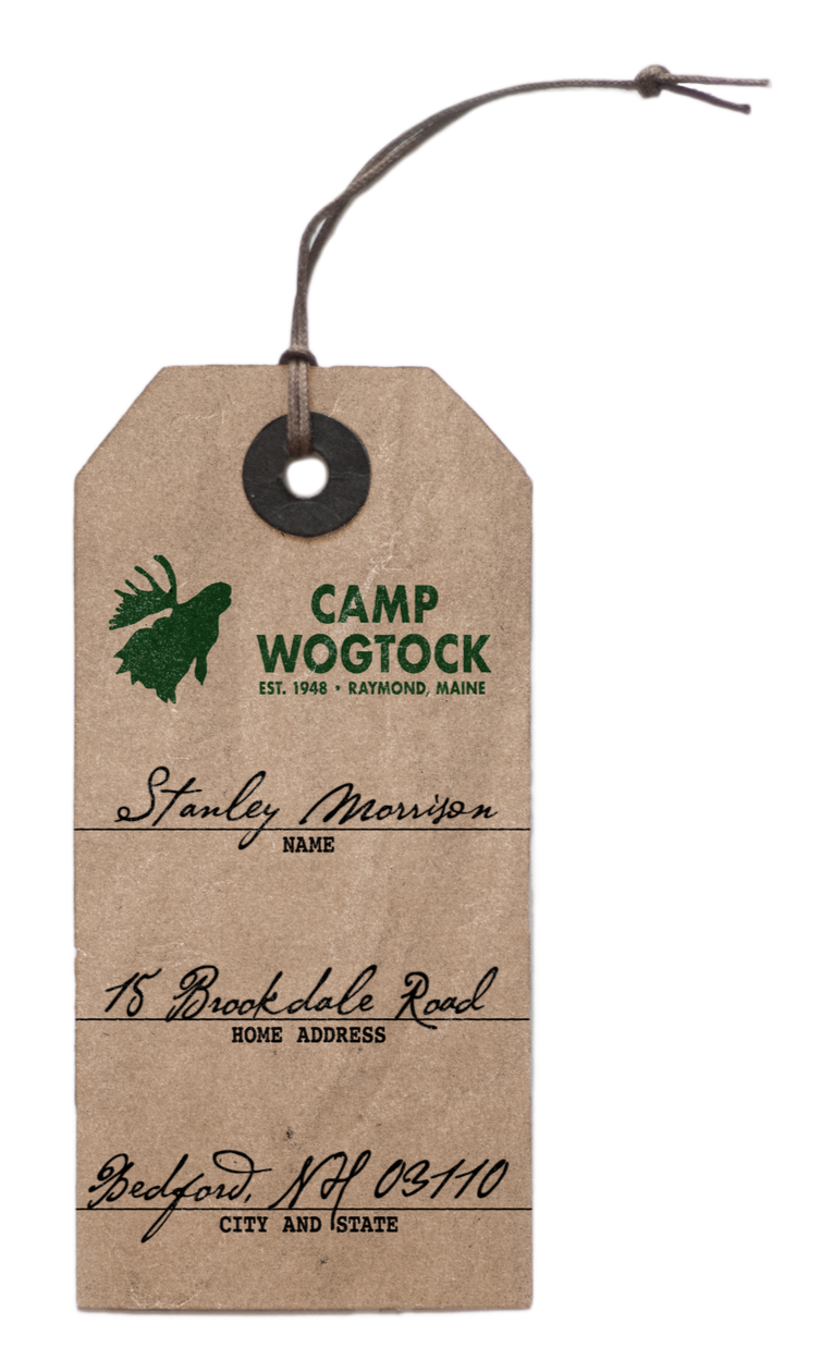
LUGGAGE TAG
A discarded luggage tag, featuring carefully written script suggesting it was written by a parent.
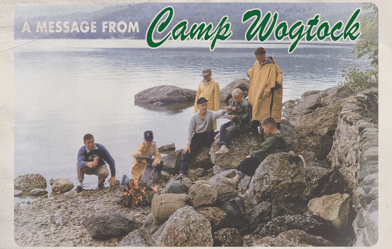
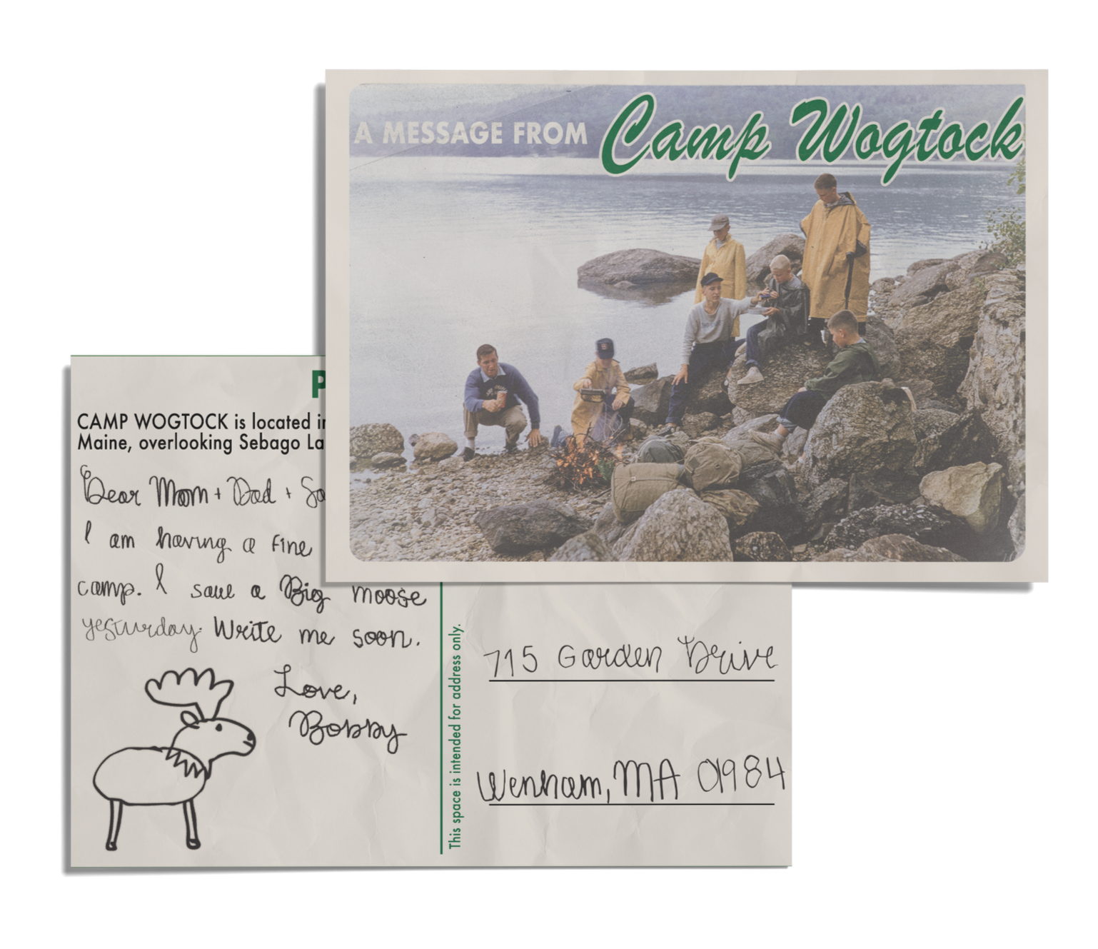
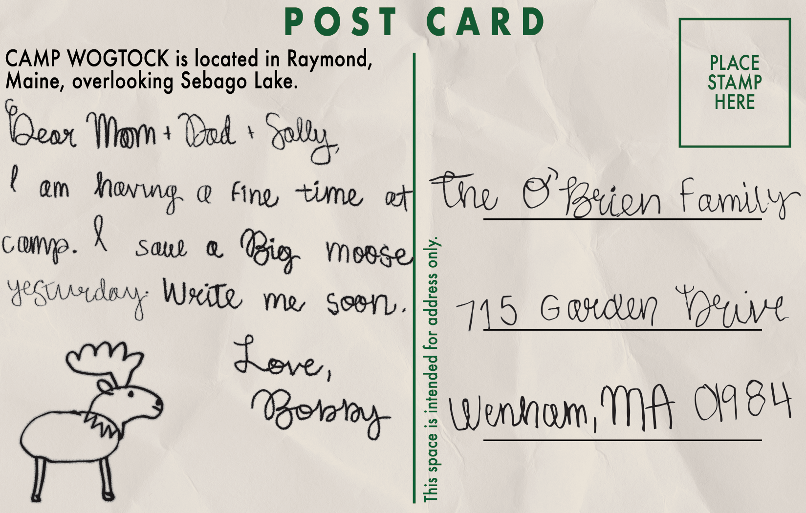
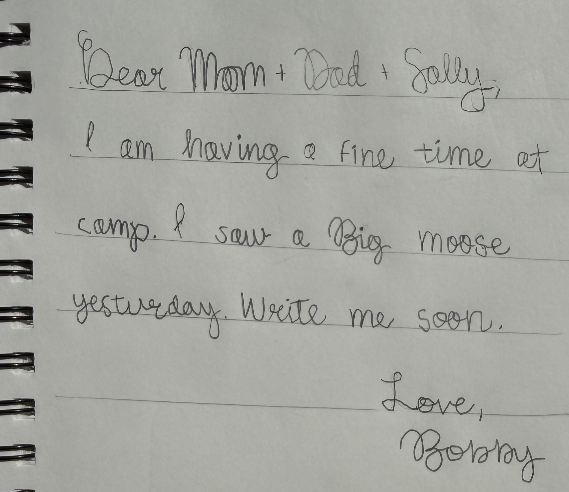
CAMPER POSTCARD
A forgotten postcard, written but never stamped or mailed. It is designed to reflect a 9-year-old boy away at summer camp in 1955, with messy writing and lack of detail, besides a simple depiction of a moose.
Imagine: little Bobby writing this quick note to his family before breakfast, and then running off to the dining hall and forgetting about the postcard altogether.

PROCESS & SKETCHES
To find a suitable image to use on the front, I searched through public historical archives looking for 1955 photographs from summer camps.
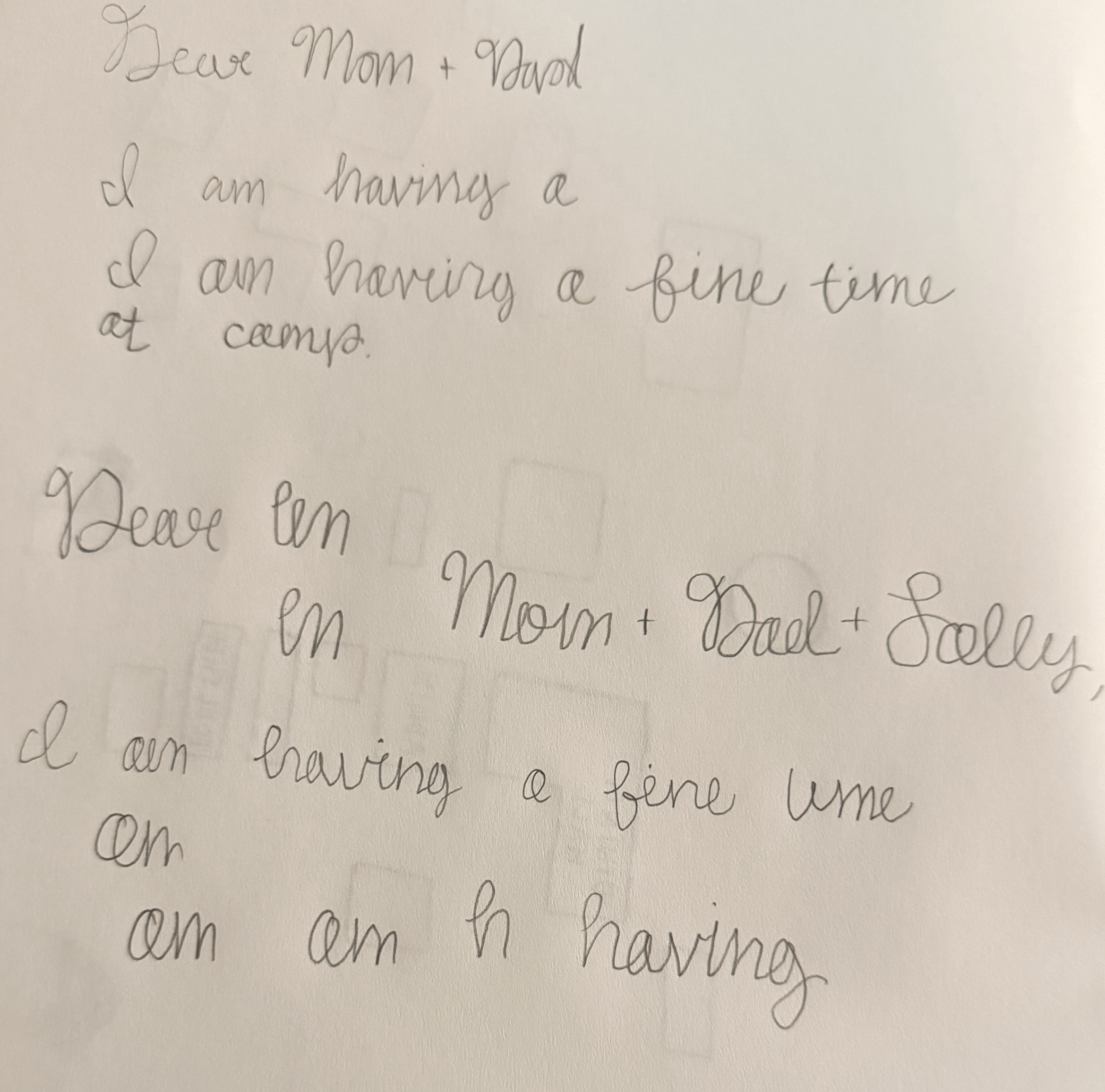
For the writing on the back, I analyzed samples from vintage elementary school cursive manuals and created my own version in a sketchbook. My goal was to make the cursive imperfect and varied, as is the writing of a young child. I also doodled the little moose illustration to go with it.
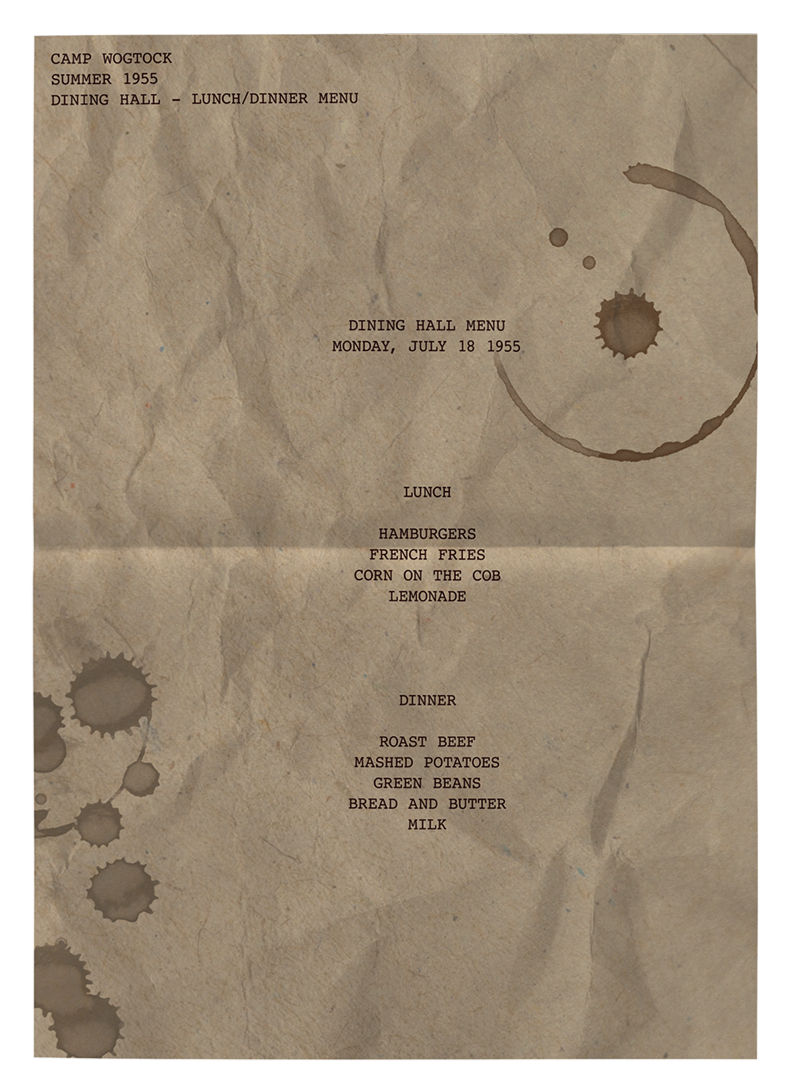
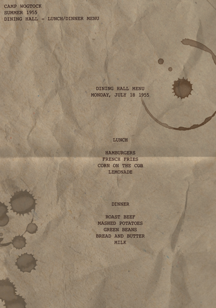
DINING HALL MENU
An old dining hall menu from the summer of 1955. Includes stains from splashes of coffee and mugs left by dining staff.
Since this is a daily menu, it would most likely be made using a typewriter in 1955. With that said, I sourced an authentic 50s typewriter font to use for this document, and added the texture, coloring, and stains using multiple different overlays.
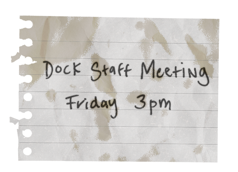
OLD NOTE
I knew in my final flatlay, I wanted to include a handwritten reminder note laying around, passed from one staff member to another. To capture this, I wrote this note in my sketchbook and transported it into Adobe Illustrator, before moving it into Photoshop for the final mockup. At that point, I added worn texture overlays and stains.